February 2009 Archives
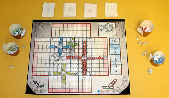
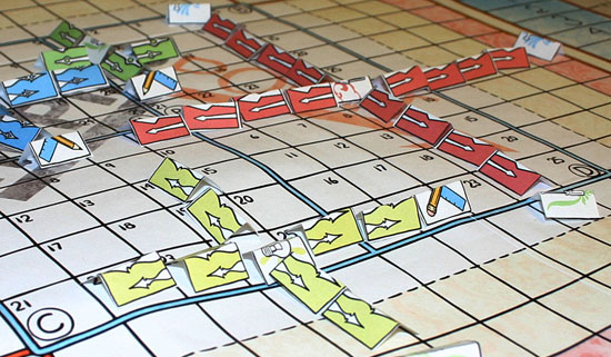
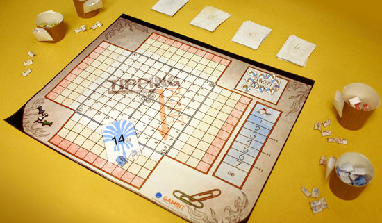
When we were building the game, we made sure that it looked great and ran properly on our development machines, not realizing how much influence that would have on our production. Not planning for wide distribution of our game made it much less accessible to other languages, regions and screen setups. Our team had an HDTV in our lab that we used for most of our initial prototypes, and all of our computers were capable of rendering at high resolutions. This led us to work under the incorrect assumption that we were developing the game only for HD displays, and we lacked the foresight to support lower-resolution televisions. In our zeal, we created so many assets that when we finally realized we should cater to lower resolutions, downsizing those assets was an insurmountable task. For example, we had many lines of text that we'd rendered as image files with fancy effects. Although the Xbox Live Community Games reviewers did not reject our submission for this reason, many of them did complain that words were cut off and that some text was too small to read. This was especially evident on CRT television screens that were less than 20" in size. However, due to time constraints and the need to ship, we had to push the title to Xbox Live Community Games without catering to lower-resolution television sets.D'oh! Check out the full postmortem for this and other stories.
It's been a while since I've posted a links list here, and there's been a ton of interesting stuff popping up lately. So, without further ado...
zomg important stuff
- Henry Jenkins: If it doesn't spread, it's dead. HJ begins to outline the new platform for C3 and his general research.
- Timo Arnall on the Internet of Things. Go now: Inkblots alum doing amazing stuff.
generally awesome stuff
- NYT: What Convergence? Why it's taking so long to get the Web on our TVs.
- Agents in the Trades. Gotta find a copy of the Feb. 09 The Writer.
- HarperCollins' new format: video books. Bwuh?
- Underland Press. Fascinating new micropublishing house specializing in the New Weird.
- In defense of the MFA. "The only people impressed by an MFA in writing are those who don't write and never worked in publishing." Ouch.
- Digital ghost towns. More awesomeness from the Tomorrow Museum.
- The business of webcomics. J. Jacques does it again.
- Q&A with Mike Carey. I love the bits on adaptation.
- The laws of the thriller. "When popular novelists, stung by critical disregard while contemptuous of it, reject literariness and describe themselves as storytellers, they may often be wrong in all but the barest mechanical sense, but they raise some useful general points: rather wholehearted pulp than earnestness; rather economy than "weight"; and rather winter in a canning factory in Narvik than John Grisham."
- TIME: Content, once king, becomes a pauper. I prefer "once and future king".
- Announcing BigIdeaAuthors.com. April 20 can't arrive soon enough.
- Indigo's Shortcovers initiative. Interesting: physical books + e-books + iPhone.
- Marvel's motion comics, Vertigo's $1 first issues and 'literary' OGNs. Fun year for comics ahead.
- Sarah Weinman on O'Reilly's future of publishing conference. "We can dream of the future all we want, one where the reading experience is a marvel of social interaction and multiple communities and fresh ideas, and dreaming is good. But change is also slower and much faster than we can possibly anticipate - and in the end, experts and enthusiasts alike only know as much as what's right in front of them, nothing more."
- John Crowley on Giordano Bruno. RIP Giordano.
- BBC: Alien life may exist among us. Cats explained at last!
- Coraline fun facts. Sad truth: I still haven't seen it yet.
- Theodora Goss on the humor of Lord Dunsany. "Life is real, life is earnest..."
- Seven reasons why
musiciansanyone should use Twitter. Awesomesauce. - How successful writers keep up their self-confidence. I'd add "not take classes from bad professors."
- Gwenda Bond on Bones of Faerie. I smell a must-read.
- Tor.com on Bones of Faerie. ""Nothing has been seen or heard from Faerie since, but the world is filled with the deadly magic the War left behind: trees that seek out human blood, glowing stones that burn with cold fire, forests whose shadows can swallow a person whole." Oh, hells yes.
- Uncle Warren on the $500 miniseries. He's right: the game, it is a-changin'.
- Trackmate. Intriguing: "Trackmate is an open source initiative to create an inexpensive, do-it-yourself tangible tracking system."
- Dmitri Orlov on social collapse. Grim. (From Bruce Sterling.)
- Starbucks announces instant coffee. Srsly, 'Via'? Via what?
- Bruce Sterling: 2009 will be a year of panic. It already is.
- Bruce Sterling: 2009 when the 21st Century really begins. It already has.
- Q&A with Gregory Frost. What are you hardwired for?
The 2009 Independent Games Festival Mobile, an event that celebrates innovation in games for handheld devices, including mobile phones, Nintendo DS, PlayStation Portable (PSP), iPhone and iPod touch, has named the finalists for the competition's "Next Great Mobile Game" category, presented by the IGF Mobile's Platinum and Founding Sponsor NVIDIA. Oriented towards the entries that offer truly unique and groundbreaking mobile gaming concepts in at least prototype form, finalists will be asked to give a presentation and demonstration of their concept and game during the IGF Mobile ceremony held during the Game Developers Conference Mobile conference on March 24, with the winner to be voted on by the audience. Finalists for this year's competition include FastFoot Challenge, a multiplayer GPS action game where play takes place as a real world chase supported by mobile phones, Picopoke, an interpretive photo game integrated with Facebook that asks players to take photos to beat challenges, and Rhythm of War, a unique rhythm action title for Sony's PSP. This year's IGF Mobile competition is supported by Platinum and Founding Sponsor NVIDIA - which is awarding "The Next Great Mobile Game" at this year's awards, with finalists to be revealed soon, as well as Gold Sponsor and Best iPhone Game prize sponsor ngmoco. The full list of finalists for the 2009 IGF Mobile "Next Great Mobile Game" competition are: Depict (VillaVanilla) - iPhone FastFoot Challenge (Urban Team) - J2ME Picopoke (Singapore-MIT GAMBIT Game Lab) - Photo/Internet-capable Mobile Handsets Rhythm of War (SME Dynamic Systems Ltd) - Sony PSP Reflection (Team Reflection - University of Southern California) - Nintendo DS As well as receiving $2,000 of the IGF Mobile's $30,000 prize pool, the winner of the IGF Mobile's "Next Great Mobile Game" will be given a spot in the IGF Mobile's pavilion (adjoining the main IGF Pavilion) in which to demonstrate a playable version of their game, alongside the finalists of the main IGF Mobile competition. The pavilion is to be at the Game Developers Conference 2009 and is set to take place at the Moscone Center in San Francisco from March 23rd to 27th.Picopoke was created by Kevin Driscoll (Product Owner), Yee Kar Kin (Scrummaster), Clara Rhee (Designer), Ang Yi Xin (Artist), Anindita Ningtyas (Artist), Munir Bin Hussin (Programmer), Pham Ngoc Hoang Viet (Programmer), Ong Yit Sin (QA Lead), Erik Sahlström (Audio Designer) and Pradashini Subramaniam (Additional Audio). Way to go, folks!
Instead of a single speaker, we're going to be doing a showcase and post mortem of the games created last weekend at the Boston site of the Global Game Jam. For those of you who don't know, the GGJ was organized by the IGDA as a game jam happening simultaneously around the world, with over 1600 participants creating over 300+ games in 48 hours. Our Boston site was hosted by the Singapore-MIT GAMBIT Game Lab. All 300 games are on the official website, but you might particularly want to check out the six games that were made in Boston. They're all open-source, too, so feel free to take a crack at the code! Hope to see you there!Post Mortem will go down tonight at 7pm at the Skellig in Waltham. For directions, click here.
The Guardian has a nice piece up at the moment tracing the life and work of Peter Porter, one of my favorite contemporary poets. At the very end of it they include one of Porter's works, which I'm reposting here to give you some sense as to why I enjoy his stuff:
Both Ends Against the MiddleDeep inside the Imperial War
Museum
Where children are surprised by
undreamt dreams
Destruction's most impartial
theorem,
The Rolls-Royce Merlin Aircraft
Engine, gleams.It seems just lowered by Donatello's
tackle:
He would have known why copper
pipes entwine
So murderous a tabernacle
And where control and fate might
share a line.The Spitfire's engine's once kinetic
fury
And Donatello's layered appetite
Are Humanism's judge and jury,
The Alpha and Omega of
delight.
from "Both Ends Against the Middle",
published in Collected Poems, Vol 2
(Oxford University Press)
What I enjoy about Porter is how he revisits the notion of rhyming poetry (which I usually associate with dry, crufty twaddle) and makes it crackle, mixing both the end-of-line rhyme scheme with an internal internal rhyme scheme to come up with erratic patchwork connections like dreams - gleams - seems in the first stanza-and-change in the work above. I also love his blending of the traditional with the contemporary, as evidenced by his suggestion of Donatello's insight into the construction of the Spitfire engine. Like some kind of a Mexican chocolate truffle, it's a short piece but multilayered, appealing first with its surface structure and then more so as you unpack the connections and surprisingly juxtaposed imagery inside. (Forgive the awkward simile – I've not yet had breakfast.)
For a Porter primer (har har), I suggest his 1997 collection Dragons in Their Pleasant Palaces, which was how I discovered him when I was studying at Exeter. He has one line, "a dream's imagination's ambulance," which has haunted me for years; I'm confident that you'll find something similar in any of his works.
I have a new post up today at the MIT Convergence Culture Consortium: Whedon's New Business Model 'Horribly' Awesome. In it I examine a couple of the highlights from the thoroughly exciting interview Joss Whedon (Buffy the Vampire Slayer, Firefly, Dollhouse) gave to Wharton at U Penn last week. Check out both the article and my commentary - from the perspective of a transmedia scholar and someone interested in doing direct-to-Internet video storytelling, this piece is an absolute must-read.
What Architecture and Urban Planning Can Tell Us About Games: An Interview with Georgia Tech's Michael Nitsche For a while there, it looked like the debate between the ludologists (who focus on game play mechanics) and the narratologists (who focus on storytelling) was going to define the range of perspectives in games studies. As someone who was falsely labeled a narratologist for a bit, I found this model of the field constraining and distorting. Now, of course, we've seen an explosion of different perspectives in the academic study of computer and video games. One of the most promising approaches emphasizes the spatial dimensions of game design, a topic which was, in fact, the real focus of my own early writing on games (and not coincidentally a recurring focus of the work of Espen Aardseth, a card-carrying Ludologist), suggesting that space is not only the final frontier but also the common ground of many of the first generation of game scholars. Michael Nitsche, a games researcher at the Georgia Institute of Technology (better known as Georgia Tech), has written a significant new book, Video Game Spaces: Image, Play, and Structure in 3D Worlds (MIT Press, 2008) which sums up what we can learn about games by examining them as spatial systems. His writing is informed not only by work in games studies but also from media studies, performance studies, urban planning and architecture. As he discusses in the interview below, this work has been informed by his work with the Digital World and Image Group at Georgia Tech. I had a chance to visit Nitsche and his colleagues down in Atlanta late last fall and came away tremendously impressed by the spirit of collaboration and exploration which exists within that particular academic community. The Georgia Tech folks are doing cutting edge work across many different research areas. I am lucky enough to have Michael's colleague, Ceila Pierce, presenting the opening colloquium this term, sharing her work on the construction of fictional ethnic identities within multiplayer game worlds. Here and next time, Nitsche shares some thoughts about the theoretical stakes of thinking about games space. You come to this book both as a game designer and as a game theorist. How have the two perspectives informed each other here? To what degree do you see your design work as a mode of experimentation with the basic building blocks of games as a medium? Can you describe for us some of the projects you've worked? How does work with games done in research centers differ from the kind of work which occurs within commercial games companies? What value do you think university-based game research brings to the evolution of games as a medium?
Most examples in the book are drawn from commercial video games but it does include a wide range of research projects, too - including some of my own practical experiments. We need these experimental game projects to fill in the gaps left by commercial titles. Commercial video games have to make money and they often have to be streamlined and optimized to reach that target - university-based games research projects have all kinds of limitations but they thankfully do not have to sell. This allows us to explore some of the more complicated areas that commercial games have to avoid to stay afloat. My own work has always been a mixture of theory and practice but I have to admit that I somehow lack a single direction in the experiments I have conducted. I have worked on educational virtual environments, procedural game spaces, virtual and mixed media performance spaces, augmented reality prototypes, and these days I start to experiment with location-based handheld applications. In my case these experiments are truly explorative. They start off with a relatively simple question and snowball into more and more challenging test beds. While a commercial game production has to streamline the design at that point and focus on the core, research projects remain free to explore. I like that - a lot. At Georgia Tech we are used to testing theory and analysis in such an experimental set up. So, shortly after I joined the faculty here, I started the Digital World & Image Group. One of our first major projects was Charbitat, an experimental game that creates a 3D world around the virtual player depending on how you play the game. First, we focused on the question of procedural space generation and how to design for these new and dynamic worlds. But once we had the functional prototype up and running, we moved on to look into procedural quest generation, dynamic camera control and patterns to support spatial navigation in infinite worlds - all based on the original game prototype. Any commercial developer would have cut this additional research, which is why this kind of gradual experimental discovery is only possible in a non-commercial environment. This certainly does not mean that academics should tell developers how to create their games, but it shows that research projects can offer additional information because they are free to explore venues that are locked off by deadlines and budgets in commercial production. Other areas are not covered by commercial games, yet. For example, I am very interested in game worlds as performance spaces where players do not play to achieve certain high scores but instead to express something effectively. Consequently, some of my projects deal with virtual puppetry or augmented reality performance spaces. I also have done quite a lot of work in machinima. The industry might recognizes the promise in these areas but it is simply not clear how these ideas might work out in a viable single application. So here the university-based research project can break completely new ground.Many accounts of game theory have emphasized the tension between ludological approaches, which focus on game play mechanics, and narratological approaches, which focus on story telling. Does a focus on game spaces give us a different way of thinking about the relations between these two approaches?
I believe it does. Space is certainly not the single answer to all of our problems but it surely predates play as well as narrative. We learn how to deal with space before we start to tell stories or play games. If we translate this into video games, space becomes a higher category, one that can include narrative qualities as well as ludic ones. I started to look into expressive 3D game spaces around 1999, when I began my studies at the University of Cambridge's Department of Architecture. This was just around the time the debate about narratology and ludology heated up. We did a lot of work with video but I felt somewhat shielded from the divide because even in the darkest controversies nobody ever argued against the importance of space in games. From where I was standing, you had to ask whether there is really a substantial divide at all between ludology and narratology. For me, both become part of how we deal with spaces and are not opposites but complementary to each other. In the book I talk about Story Maps, a form of imaginary map that we form in our mind as we play our way through a virtual environment. These maps are shaped by what we do in the game world as well as how the action it told through various forms of presentation in sound and image. Sure, there is a strong narrative element in these maps but they can only be created when the game is played. So I could never really fully see the divide because my work seemed to be right in the middle of this discussion without conflicting with either.A key goal throughout the book has been to map the many different devices that shape the player's perception and experience of games space. What value is such a catalog to the game designer? What do you see as some of the under-developed opportunities in the creation of expressive game spaces?
Game Studies has covered a lot of ground and opened up a wide range of approaches, which is good. What I suggest is a combination of different fields. That is why the book references various disciplines from architecture to film, to drama and literature studies. Game designers very often use these and other references already as they collect ideas and inspirations. They do this often intuitively and this book might help to stimulate this messy process and provide an additional perspective. Any designer worth their salt is aware of the fundamental role of a video game such as Mario 64 for the way we design games today; this book offers an additional view at some details regarding these innovations specifically for 3D game worlds. It does not suggest a single solution or a unique missed opportunity but instead discusses a range of available options by looking at the underlying basics. For example, the whole argument of the book is built on the idea that game worlds are not simply polygon masses arranged in a certain way in the engine. Instead, we should look into different layers where game spaces come to life. These include the play space in the living room of the player, as well as the fictional and mediated spaces generated by the presentation and the imagination of the player. The rule-based level is only one of five layers for game space analysis. The task, then, is to find the connections between the different layers. New interfaces such as the Wii remote or webcams are good examples for these connections. They put much more emphasis on the world in front of the screen. But what can we make of this expansion into the physical space? Among other things, the book invites us to think about ways these connections into the living room can be made more effectively.Throughout the book, you draw heavily on ideas from architecture and urban planning. What do these fields have to contribute to games studies?
There are some obvious parallels, such as the relevance of urban planning for the design of free-roaming game worlds or the way architectural styles are copied in video games. However, I would argue that we have to look a bit deeper to identify more fundamental parallels. One example for a more direct connection is the way we read large-scale environments no matter whether it is a real world like my hometown or a virtual one like an online world. We gradually form a cognitive map based on certain key features and navigate through the world based on this map. Architectural theorists like Alexander or Lynch have done extremely valuable work in precisely this area and a range of research projects has shown that the same ideas apply to virtual environments. However, games offer different means to accentuate a players' development of a cognitive map. Designers have full control over the space and the possible actions in it and use it to dramatize the experience. That is why we also have to take theatrical spaces into account. Most virtual worlds are designed not for a "live-like" experience but for overly dramatic ones. These game worlds would fall short if they would provide "only" realistically functioning virtual cities. Instead, they have to deliver virtual stages, full or extraordinary events and opportunities that are not available in real world designs. That is why we have to add these dramatic functions to the architectural ones and combine dramatic moments with cognitive maps. Likewise, architecture is very helpful in the discussion of specific spatial structures, such as paths, arenas, or labyrinths. They clearly reflect and reference existent architectural structures but we have to add the game specific elements that usually enhance their dramatic impact. The labyrinths of Doom or Silent Hill are not just navigable virtual architectures but the actively put the player into a highly engaging dramatic situation. The video game world tells the player where she is projecting her actions. It positions the player via spatial means and uses references to architecture and urban planning. At the same time, it is a dramatic positioning. Players do not enter a game world as a neutral observer or visiting tourists but as cops staged in the middle of a gang war, a superhero with the power to destroy or rescue Metropolis, a lost soul that only tries to escape and survive. These options are embedded in the game world's architecture, its presentation, and its functionality. Urban planning, architecture and performance studies help us to balance and connect these features better.You also suggest that the design of games space has been heavily influenced by our shared understanding of cinematic conventions. Which aspects of film form exert an influence on the design of game worlds?
Video games, film, and television are all part of the moving image media family. They share many aspects, differ in many others and continuously add to each other's vocabulary through their shared origins. There are at least two connections that we have to take into account when we discuss game spaces and their visual representation. On the one hand, a large number of games try to remediate cinematic visuals. There is no reason for a lens flare effect in Unreal Tournament because there are not physical optics involved. But the programmer included it. Neither is there any technical reason for suddenly increasing grainy imagery in sections of Fatal Frame. But the images are altered nevertheless. These are rendering effects applied to the game world in order to recreate cinematic visual effects and to achieve distinct dramatic impacts. Most of the time, we have to read and understand a game world to interact meaningfully with it. That is why visualization is a very powerful form of expression in digital games and not necessarily subordinate to interactivity. Cinematic traditions are built into these games to direct our reading of the world. Because designers constantly develop new visual expressions for their games, we cannot pinpoint a single cinematic reference point for video games. The main visual traditions of 3D game cinematography (following camera, overhead view, first-person point of view and pre-defined viewing frames) have all connections to existent cinematic traditions but they have developed their own specifics over time. The interactive following camera, for example, changes the way that the main character is visually situated in the game world and often becomes not only a visual but also a action controlling device when the hero is programmed to always run in the direction the player points the camera. Equally important is the question of montage of different viewpoints in video games. Film has developed multiple techniques of montage and games seem to gradually follow with some own concepts that are organized around their interactivity. In many 3D games players not only control the virtual hero but have also taken on the role of virtual cameramen and editors. Maybe the most surprising fact is how seamlessly audience can accept this responsibility. The camera work in the newer Prince of Persia titles is highly developed and might be influenced by the player in the midst of equally complex game play situations. Nevertheless, players seem to readily adapt to that task. Nowadays, a player not only accepts the role of the virtual hero but also that of the "man with the movie camera." And this transition happened extremely smoothly overall. Maybe because of our familiarity with cinematic techniques. This points to the second main connection between games and film: players have developed certain expectations towards the moving image. We have been educated by television conventions and cinematic visual storytelling and look at game through this expectation.
This allows players to understand the elegant intro sequences of the Half-Life games as descendents of the classic long opening shots that we have seen in Altman's The Player or Welles' Touch of Evil. Players bring this kind of media literacy to the game and can read it through their proficiency in film and TV visual storytelling. So we expect games to work a bit like movies because film and TV are essential sources of our visual literacy.
This is a two-way street, of course, and with the growing role of games as media for socialization the influences starts to shift. We can see that games start to educate our visual expectations and drive shots in television and cinema productions. So instead of a single influence I would argue for a growing shared ground that is based on the tradition of the moving image.As you note, game designers rely on a range of spatial metaphors to discuss their craft -- drawing parallels between games and gardens, sand boxes, amusement parks, labyrinths, mazes, and arenas or talking about games as being on "rails" or "tracks." Which of these analogies are most productive for thinking about games space? Which do you think are confusing or misleading?
The book does not directly pick up the discussion of games as gardens or sand boxes - not because these metaphors are misleading but mainly because to me it seemed that a lot of detail is lost in such an approach. These are very useful approaches and often well applied in other works but a bit too large for the detailed analysis I had in mind. In my case, I tried to look into more precise spatial subcategories - like the path, the arena, or the labyrinth. So instead of discussing the overall summary of a virtual space, which indeed might work and feel like a virtual garden, the focus is on details that might evoke this impression. I call these details evocative narrative elements and they work like spatialized hooks that affect the way the player experiences the game universe. They support the player to make sense of the virtual world and the situations in it and offers opportunities to connect and contextualize the events in relationship to each other. Finding a item important to the player, defeating an opponent or saving a friendly character, discovering the value of a certain item and overcoming threshold - all these can be evocative narrative elements that are situated in the game world. However, how the player truly interconnects these hooks is up to her. Evocative narrative elements can add up to a fuller picture of a garden of a sandbox-like world, but in the end this depends very much on the player. That is why I suggest a different metaphor in the end of the book, namely that of the kitchen. The kitchen caters for the growing role of players in the formation and re-usage of game environments. Following established recipes or gradually experimenting with new ones might be translated in the players' actions in innovative titles from Spore to Little Big Planet to Second Life or MetaPlace. And getting all the set up right might just about decide the fate of worlds like Sony's Home.Michael Nitsche is an Assistant Professor at the School of Literature, Communication, and Culture at the Georgia Institute of Technology where he teaches courses on virtual environments and digital moving images. Michael heads the Digital World and Image Group, which works the design, use, and production of virtual spaces, Machinima, and the borderlines between games, film, and performance. His work combines theoretical analysis and practical experiments and his collaborations include work with the National Film and Television School London, Sony Computer Entertainment Europe, Turner Broadcasting, Alcatel Lucent, and others. He is author of Video Game Spaces: Image, Play, and Structure in 3D Worlds (MIT Press, 2008), and has published on Game Studies, virtual worlds, digital performance, games and film, and machinima in numerous publications. In a former life he was co-author for a commercial videogame, professional Improv actor, and dramaturgist. (This interview originally appeared at Henry Jenkins' blog Confessions of an Aca-Fan on February 6, 2009.)
This talk by Celia Pearce, Assistant Professor of Digital Media at Georgia Tech and Director and the Emergent Game Group and Experimental Game Lab, explored the connection of identity to virtual place, referencing in particular anthropology, humanist and socio-geography and Internet studies to look at the construction and performance of "fictive ethnicity" tied to a specific, though virtual and fictional, locality. To illustrate, Pearce used the example of the "Uru Diaspora," a game community from the defunct massively multiplayer game Uru: Ages Beyond Myst (based on the Myst series), which emigrated into other games and virtual worlds, adopting the collective fictive ethnicity of "Uru Refugees," and referring to Uru as their "homeland."A few pictures from Dr. Pearce's lecture are now available in our Flickr pool (one, two, three, four). For more podcasts from the CMS Colloquium Lecture Series (including other GAMBIT guests such as Michael Mateas and Denis Dyack, check out http://cms.mit.edu/news/podcast.A subscribable RSS feed is available at http://feeds.feedburner.com/mitcms/podcast or via iTunes. To subscribe to the CMS podcast e-mail notification list, click here.
Well, that was... Something. The trip to New York was a remarkable success in some regards, an all-out failure in others, and also bizarrely insightful in still others. A quick run-down:
The Successes
- Getting to stay with Sam and Amanda one more time before their baby arrives
- Onigiri, cupcakes and other delicacies with Emily
- Texas BBQ NYC-style with Sam and Amanda
- Getting to show Laura Rockefeller Square
- Checking out the Gap / PANTONE pop-up store (mimosa yellow t-shirt GET)
- Scoring a couple of choice finds at the NYCC
The Letdowns
- Having the Saturday NYCC tickets cease being on sale online on Friday morning, and then be completely sold out on Friday night
- As a result, not getting to meet up with David, Ellen, Elizabeth and Stephen
- Not getting to meet up with Elizabeth on Sunday because I missed her call (Sorry!!!)
- Not attending a single panel at the Con due to a combination of bad timing, exhaustion and disinterest (the Fringe panel would have been interesting, but getting home before midnight proved more compelling)
- New York traffic
- Taking the wrong instance of route 5 off I-91 in Connecticut, thus sending us strolling through Hartford instead of rocketing up the interstate as planned (seriously, 5 crosses I-91 three times and Google maps didn't include exit numbers in its directions – Google Maps FAIL)
The Insightful
- I went to the Con planning to scour the half-price graphic novel vendors for my missing Cerebus volumes, but when I arrived at their booths I didn't have the dedication to thumb through their massively disorganized longboxes.
- Instead, I found half-price editions of the second, third and fourth Collected Peanuts editions from Fantagraphics and the Art of My Neighbor Totoro from Viz Media, and was greatly overjoyed by this discovery – proving that my trajectory into comics history and visual artistry continues
- I had way too much fun tagging along with Sam and Amanda as they went shopping for baby stuff. Not yet, hormones! Back! Back!
- I'm very glad we went and I had a wonderful time, but it's slightly disturbing that every time I go to one of these things I find myself swearing I'll never go to another one due to the horrifying crowds. As is usual with cons and the like, the best times were had outside of the scheduled programming and off the convention floor.
So, yes. Another NYCC come and gone, and once again I find myself realizing that, at least at this time of my life, Readercon is much, much more my speed.
And now I'm off to begin chugging through the backlog of emails and work requests that flooded my inbox over the weekend. Once more unto the breach, dear friends...
For the last couple of weeks, Laura's been threatening to strangle me because I've been doing more waffling than Belgium. The cause? Oh, just a little thing called the New York Comic-Con.
See, we went last year and had a wonderful time, and up until recently I'd been planning (and really looking forward to) our return trip. Then January rolled around and I was doing our budget for the year (what with Teh Hitching™ going down in October and all). Suddenly a Comic-Con looked a lot less feasible.
Then, in the last couple of weeks, the number of people going to Comic-Con started to pop out of the woodwork, including David, Ellen, Elizabeth and Stephen. It was becoming increasingly clear that from a professional standpoint, it was only making sense to go. Clearly. Or, at the very least, that I could write off the trip on my taxes.
So, suddenly a Comic-Con has appeared on my calendar! Laura and I are jumping in the car here in about an hour and doing the four-hour drive to NYC (barring traffic time), where we will be staying in New Jersey with Sam and Amanda, then heading into the Con on Saturday, seeing as many people as humanly possible and then meeting up with our friend Emily from Columbia in the evening. Sunday morning will be up to interpretation.
So, yes! I'm coming to New York! Anyone else in town who might want to get together (*cough*IvanChrisVanessaKaren*cough*) should shoot me a text and let me know when you'll be available. Big Apple, here we come!
A perfect example of the old adage that good things come in small packages, the unassuming, overlooked, practically invisible CarneyVale Showtime from the Gambit Game Lab is one of last year's best titles that nobody played. Located in the user-created Community Games section of the new Xbox 360 dashboard, there's not really anything to distinguish CarneyVale from the dozens of uninspired games tucked away there--but only after a minute or two of play, it's clear to see that it stands head and shoulders above the rest. Although initial impressions might be deceiving, CarneyVale Showtime is in fact, an extremely elegant and clever design that requires a good degree of hand-eye coordination. Its challenge is nicely complemented by the absolutely spot-on controls and impeccable level of polish present everywhere throughout the game.Be sure to jump over and read the whole thing, but the review's ending is incredibly flattering. "Relatively simple, tactile games like CarneyVale Showtime are few and far between these days, and ones as well-done as this number even fewer," Gallaway writes. "It may be found in the amateur section, but CarneyVale Showtime is a consummate professional." As revealed at Metacritic, Gallaway gives Showtime a 9 out of 10 (!), which is the same as Jim Sterling recently gave the game in a review at Destructoid (!!!). As Sterling begins his glowing review:
When I first started challenging Community Games developers to submit their work for review on Destructoid, I had hoped that some real gems would come out of the woodwork and prove their worth. I had not, however, expected CarneyVale Showtime. At the risk of spoiling the whole review before you even read it, let me say that if you're at all interested in the potential of XNA games, then you really, really, really need to check this one out. A breath of fresh air? This is more like a gale of the stuff.Sterling goes on to describe Showtime as "inventive, addictive, charming and very clever, with deceptively simple gameplay that soon gives way to something far more complex and fiendish". (Mwa ha ha.) "If there were any justice, this game would be expanded and end up on the Xbox Live Arcade," he writes. "As it stands, however, CarneyVale is an absolute steal for 400 Microsoft Points." To say that we're proud of Showtime is an understatement, but it's Gallaway's description of it as "overlooked" and "practically invisible" that we're out to fix. If you haven't tried Showtime yet, what are you waiting for? If you have, tell your friends! Tell your friends' friends! Or jump onto Metacritic.com and tell the world what you think! (Unless, of course, you didn't like it - in which case we humbly suggest that you try playing something else.)

The official call for art, courtesy of Ellen Kushner, Gavin Grant and Connie Toebe, is as follows.
The Interstitial Arts Foundation is searching for cover art for our second literary anthology, Interfictions II. All visual artists are invited to submit images for possible use as the cover art of the anthology.
From February 2 - 16, artists are invited to post images on our Flickr group at http://www.flickr.com/groups/interstitialarts for all to enjoy. At the end of that time, the editors of Interfictions II, Delia Sherman and Christopher Barzak, along with Small Beer Press publisher Gavin Grant and Interfictions I cover artist Connie Toebe, will choose an image for the cover of this exciting original anthology, to be published in November, 2009.
What are we looking for? Any visual image that might look good on the cover of a book. It could be a painting, a computer image, collage, sculpture or maybe even a piece of clothing. The first volume's cover was actually a photo of a 3-dimensional diorama box, so a photo of a sculpture or craft piece is not out of the question. Contributing artists should be sure to consider their art in the context of a book cover. A book cover isn't simply a pretty picture but part of a complete design. If you're photographing a 3-dimensional piece (especially something that isn't rectangular) please remember that the quality of the photo counts as well. A nicely composed photo is as important as the quality of the artwork in the image. The book cover will be 5.5" wide and 8.5" tall so a horizontal or square image might not work as well as a vertically oriented one. That being said, we'd love to be surprised. Show us something we've never seen before!
The details:
- The final image will have to be available as a JPG, at least 5.75" x 8.75" at 300dpi. For the Flickr group, artists need only post low-resolution versions of their images. If your image is selected, we will contact you and request that you send us the high-resolution version for printing.
- The deadline is February 16, 2009. The Interfictions II Flickr site is the same as the IAF Flickr site: http://www.flickr.com/groups/interstitialarts.
- Artists are limited to posting 3 images for consideration. If we like your art but not the images you chose, we may write and ask you for more.
- Although interstitial art is by definition wonderfully wide-ranging and experimental, we retain the right to remove anything from the pool that we deem inappropriate.
- The artist whose work is chosen will receive a $500 fee from the IAF for the use of their image on the Interfictions II cover along with the rights to use the image in any publicity for the book and for the IAF. Artist retains the original artwork and the copyright on the piece.
- The editors reserve the right to use art from another source for the cover. However, we are holding this search not only to choose a cover for our anthology, but also to make more artists aware of the work of the IAF and to give everyone a chance to see more really good interstitial art. In that spirit, we will spotlight the cover art as well as five runners up on the IAF blog at http://www.interstitialarts.org . In addition, the most recent entries to the Flickr group will be syndicated into a section of the IAF homepage for the duration of the search, and quite possibly beyond.
Questions? Post as comments here, and we'll answer them as soon as possible.
Good luck! We look forward to seeing your artwork!

I'm both honored and excited to be working with the IAF. The group counts among its members a number of true luminaries currently working in the creative arts, and its mission of promoting works that fall outside of traditional genre boundaries is very near and dear to my heart. Keep an eye on this space, as well as over at www.interstitialarts.org, for more information – and if your interests also lie along interstitial lines (as many fans of such creators as Neil Gaiman, Jonathan Carroll, Holly Black, Ellen Kushner, Gabriel Garcia Marquez, Umberto Eco, Henry Jenkins, JJ Abrams, Joss Whedon, Warren Ellis, Gregory Frost, Delia Sherman, Weird Tales magazine, Comparative Media Studies, and a billion other interesting things are likely to be), please consider joining me as a friend of the IAF. It's a brilliant group of people and an incredibly exciting place to be right now – consider yourself invited along for the ride!

Identity-as-Place: Fictive Ethnicities in Online Games & Virtual WorldsWe would like to extend the warmest of welcomes to Dr. Pearce, and we hope to see you all on Thursday evening!
This talk explores the connection of identity to virtual place, referencing in particular anthropology, humanist and socio-geography and Internet studies to look at the construction and performance of "fictive ethnicity" tied to a specific, though virtual and fictional, locality. To illustrate, Pearce will use the example of the "Uru Diaspora," a game community from the defunct massively multiplayer game Uru: Ages Beyond Myst (based on the Myst series), which immigrated into other games and virtual worlds, adopting the collective fictive ethnicity of "Uru Refugees," and referring to Uru as their "homeland." The study referenced concerns the largest group of Uru refugees, who immigrated into the virtual world There.com. These players developed unique hybrid cultures other games, including the creation of Uru-inspired digital artifacts, and through an eventual process of "transculturation" (Ortiz 1947) eventually transformed from "Uruvians" into "Uru-Thereians," integrating both virtual places into their collective identity. Through this example, Pearce will argue that in the current historical moment, in which connections between identity, community and place are being supplanted by the generic placenessness and identilessness of "global markets," the tendency of players in the Uru Diaspora to construct a shared, place-based identity may reflect a larger need by individuals to associate themselves with affinity groups and reclaim a sense of connection between a specific locality (place), community and identity. Celia Pearce is a game designer, author, researcher, teacher, curator and artist, specializing in multiplayer gaming and virtual worlds, independent, art, and alternative game genres, as well as games and gender. She began designing interactive attractions and exhibitions in 1983, and has held academic appointments since 1998. Her game designs include the award-winning virtual reality attraction Virtual Adventures (for Iwerks and Evans & Sutherland) and the Purple Moon Friendship Adventure Cards for Girls. She received her Ph.D. in 2006 from SMARTLab Centre, then at Central Saint Martins College of Art and Design, University of the Arts London. She currently is Assistant Professor of Digital Media in the School of Literature, Communication and Culture at Georgia Tech, where she also directs the Experimental Game Lab and the Emergent Game Group. She is the author or co-author of numerous papers and book chapters, as well as The Interactive Book (Macmillan 1997) and the forthcoming Communities of Play: Emergent Cultures in Multiplayer Games and Virtual Worlds (MIT 2009). She has also curated new media, virtual reality, and game exhibitions and is currently Festival Chair for IndieCade, an international independent games festival and showcase series. She is a co-founder of the Ludica women's game collective.
Each round of the compeition was a best of three match up in which teams who were eliminated early on move down to a loser's bracket, with the winner of the loser's bracket having a chance for redemption if they can beat the winner twice in a row. Each match up was fought one of a set of several simple 2D maps which featured variable terrain and obstacles. Within each map were a few randomly placed "flux" (i.e. points) mines, and a team could win by gaining much more flux than their opponent. Flux mines needed to be controlled by a team in order to collect flux, and therefore these points were often the focus points of skirmishes due to their high value. Each team started with a set of 6 flying, non-replaceable, self repairing archons which were the most valuable units in the game. Archons couldn't attack directly, but could spawn other disposable attack units like soilders and cannons. These attack units were useful as they could be used to attack (and potentially destroy) archons, tipping the tide of the game. Several strategies were employed in the game, including having archons mass together and attack as a unit while ignoring flux in an effort to destroy the opposing team early. Another strategy was to split up and mine flux like crazy, hoping to survive enemy onslaughts. One of the more creative stratgies (employed by Greg from Rob Miller's HCI group at CSAIL) involved sending gigantic messages to enemies which would actually overload their message handlers, causing their scripts to fail in a sort of information warfare. The most successful teams would adapt to their enemies between match ups within rounds to exploit what they learned in the previous match up.Check out Eitan's complete report for the nail-biting details! Meanwhile, Mark Sullivan and his team won another of MIT's annual events, the 6.270 Autonomous LEGO Robot Design competition. Pictures are available of Mark and his robot in the Tech and a whole mess of other images at the event website. Added coolness points? Sullivan's team, Team 3, named their bot GLaDOS. Now where have we heard that name before...? Congratulations, guys! We're proud of ya!
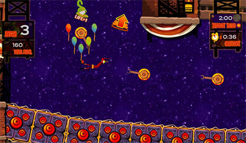
How did the art style change between Wiip and Showtime? If Wiip was the growing child, then Showtime is the maturing teenager. For Showtime, the art style took a more circus city feel to it. It was literally a city with circus performances on its streets. With that, we could have all assortments of neon signs, glowing lights and bustling color. The genral rendering of the characters also took a more mature turn. instead of kiddy characters, the characters in Showtime are more proportionate and grown. The style of shading also changed, employing more tones of shade and detail. Despite all the changes, the art style was generally kept to roughly the same feel. The bright and colorful characters and scenery were still present, and the quirky designs never disappeared. It was just an art style evolving as time went on. Who or what would you cite as the inspirations behind CarneyVale's art style? The biggest inspirations for the art style for Showtime were definitely Cirque du Soleil and Las Vegas. I remember the team watching video performances by the Cirque du Soleil troupe, and the costume designs just blew my mind away. Las Vegas was also a huge inspiration to the art style. Being a city circus, I looked to Las Vegas for its neon lights and signboards to give life to CarneyVale. I also used Las Vegas a lot when trying to merge a circus and city together. I would look at photos of that city, and imagine it with circus elements on it, and it would always work. Artists such as Yoji Shinkawa also give me tons of inspiration. Famous for his work in the Metal Gear series, what I really like about his works is his ability to generate such a distinct style of his own. The way he paints and conceptualises his ideas are what I respect most about this particular artist.
The trailer for Showtime
How did you consciously use the art style to tie Wiip and Showtime together? The colors were the main things. When I was working on Showtime, I made sure that my color palette contained all the colors I used with Wiip. This was mainly the reds and yellows, however, I made sure to inject new tones and colors to keep things fresh. I also made sure to include the familiar red and white curtains from Wiip in Showtime as well. This served as a link between the two games, and added a distinct circus vibe to the game as well. The general details for the items in the world were also kept consistent to tie the two games together. For example, I employed a certain motif in Wiip that I reused on some of the props in Showtime to keep the world whole and seamless. Most importantly, the narrator for Showtime is the main character from Wiip. No better way to tie two games together than that.
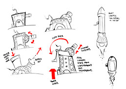
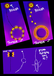
What's your usual workflow like? How do you go about creating a piece of art for the game? Usually I start with an idea. Ideas can come from anywhere. I got the idea for the Grabber prop by walking past those toy machines where you had to direct a hand to grab the toy you wanted. When I have a general idea down, I take it to the paper and pen. I sketch my ideas out and make sure to do as many variations of it as I can. I also find it very useful to get input from the people around me at this stage when the idea is still fresh and at its infant stage. Around this point, I start choosing the best few concepts and proceed to creating art for the game. I use Photoshop to draw out and color the art, and once that is done, I export it out and get it ready to be put into the game. From here on, it's mostly seeing what works and what does not. For example, the launcher for the missile looked good on paper, but when it was put into the game, it was a little too big and bright. The good thing is that once the art is there, it's mostly just tweaking to strike the perfect balance between making it look good and work well too. If you were to do a third game in the series, what new types of imagery would you like to explore? Wiip took place inside a busy circus tent, and Showtime took place in a bustling city at night. For the third installment, I would really like to see how the game would look like in outer space. We initially wanted to bring Showtime into space for the last few performances, but scrapped the idea in the end. What I really want to try is actually put Slinky in a world where gravity is at its weakest. The image of Slinky doing a double back flip in slow motion while floating upwards is too good to throw away. Being outer space, I could go crazy with the art style. There are just so many quirky things an artist can design when he isn't restricted. Imagine shooting through the stars on a flying comet as you are flung through rings of fire in front of a multi-colored nebula. It would be nothing short of legendary.
The winner of the Independent Games Festival's Seamus McNally Grand Prize will be announced at the Game Developers Conference in San Francisco this March. Keep an eye on this blog for more details! (Note: this post previously appeared over at GAMBIT co-PI Henry Jenkins' blog, "Confessions of an Aca-Fan", at www.henryjenkins.org. For a veritable cornucopia of media studies-related interviews, essays and insights, be sure to bookmark that site.)


