Recently in Thoughts Category
February 10, 2009
Henry Jenkins Meets Michael Nitsche
Late last month, GAMBIT's co-PI Henry Jenkins was kind enough to allow me to guest-star over at his blog Confessions of an Aca-Fan and share with his readers my interview with CarneyVale's artist Desmond Wong. Today we'd like to invite Henry into our blog to share his interview with Georgia Tech's Michael Nitsche. Take it away, Henry!
What Architecture and Urban Planning Can Tell Us About Games: An Interview with Georgia Tech's Michael Nitsche For a while there, it looked like the debate between the ludologists (who focus on game play mechanics) and the narratologists (who focus on storytelling) was going to define the range of perspectives in games studies. As someone who was falsely labeled a narratologist for a bit, I found this model of the field constraining and distorting. Now, of course, we've seen an explosion of different perspectives in the academic study of computer and video games. One of the most promising approaches emphasizes the spatial dimensions of game design, a topic which was, in fact, the real focus of my own early writing on games (and not coincidentally a recurring focus of the work of Espen Aardseth, a card-carrying Ludologist), suggesting that space is not only the final frontier but also the common ground of many of the first generation of game scholars. Michael Nitsche, a games researcher at the Georgia Institute of Technology (better known as Georgia Tech), has written a significant new book, Video Game Spaces: Image, Play, and Structure in 3D Worlds (MIT Press, 2008) which sums up what we can learn about games by examining them as spatial systems. His writing is informed not only by work in games studies but also from media studies, performance studies, urban planning and architecture. As he discusses in the interview below, this work has been informed by his work with the Digital World and Image Group at Georgia Tech. I had a chance to visit Nitsche and his colleagues down in Atlanta late last fall and came away tremendously impressed by the spirit of collaboration and exploration which exists within that particular academic community. The Georgia Tech folks are doing cutting edge work across many different research areas. I am lucky enough to have Michael's colleague, Ceila Pierce, presenting the opening colloquium this term, sharing her work on the construction of fictional ethnic identities within multiplayer game worlds. Here and next time, Nitsche shares some thoughts about the theoretical stakes of thinking about games space. You come to this book both as a game designer and as a game theorist. How have the two perspectives informed each other here? To what degree do you see your design work as a mode of experimentation with the basic building blocks of games as a medium? Can you describe for us some of the projects you've worked? How does work with games done in research centers differ from the kind of work which occurs within commercial games companies? What value do you think university-based game research brings to the evolution of games as a medium?
What Architecture and Urban Planning Can Tell Us About Games: An Interview with Georgia Tech's Michael Nitsche For a while there, it looked like the debate between the ludologists (who focus on game play mechanics) and the narratologists (who focus on storytelling) was going to define the range of perspectives in games studies. As someone who was falsely labeled a narratologist for a bit, I found this model of the field constraining and distorting. Now, of course, we've seen an explosion of different perspectives in the academic study of computer and video games. One of the most promising approaches emphasizes the spatial dimensions of game design, a topic which was, in fact, the real focus of my own early writing on games (and not coincidentally a recurring focus of the work of Espen Aardseth, a card-carrying Ludologist), suggesting that space is not only the final frontier but also the common ground of many of the first generation of game scholars. Michael Nitsche, a games researcher at the Georgia Institute of Technology (better known as Georgia Tech), has written a significant new book, Video Game Spaces: Image, Play, and Structure in 3D Worlds (MIT Press, 2008) which sums up what we can learn about games by examining them as spatial systems. His writing is informed not only by work in games studies but also from media studies, performance studies, urban planning and architecture. As he discusses in the interview below, this work has been informed by his work with the Digital World and Image Group at Georgia Tech. I had a chance to visit Nitsche and his colleagues down in Atlanta late last fall and came away tremendously impressed by the spirit of collaboration and exploration which exists within that particular academic community. The Georgia Tech folks are doing cutting edge work across many different research areas. I am lucky enough to have Michael's colleague, Ceila Pierce, presenting the opening colloquium this term, sharing her work on the construction of fictional ethnic identities within multiplayer game worlds. Here and next time, Nitsche shares some thoughts about the theoretical stakes of thinking about games space. You come to this book both as a game designer and as a game theorist. How have the two perspectives informed each other here? To what degree do you see your design work as a mode of experimentation with the basic building blocks of games as a medium? Can you describe for us some of the projects you've worked? How does work with games done in research centers differ from the kind of work which occurs within commercial games companies? What value do you think university-based game research brings to the evolution of games as a medium?
Most examples in the book are drawn from commercial video games but it does include a wide range of research projects, too - including some of my own practical experiments. We need these experimental game projects to fill in the gaps left by commercial titles. Commercial video games have to make money and they often have to be streamlined and optimized to reach that target - university-based games research projects have all kinds of limitations but they thankfully do not have to sell. This allows us to explore some of the more complicated areas that commercial games have to avoid to stay afloat. My own work has always been a mixture of theory and practice but I have to admit that I somehow lack a single direction in the experiments I have conducted. I have worked on educational virtual environments, procedural game spaces, virtual and mixed media performance spaces, augmented reality prototypes, and these days I start to experiment with location-based handheld applications. In my case these experiments are truly explorative. They start off with a relatively simple question and snowball into more and more challenging test beds. While a commercial game production has to streamline the design at that point and focus on the core, research projects remain free to explore. I like that - a lot. At Georgia Tech we are used to testing theory and analysis in such an experimental set up. So, shortly after I joined the faculty here, I started the Digital World & Image Group. One of our first major projects was Charbitat, an experimental game that creates a 3D world around the virtual player depending on how you play the game. First, we focused on the question of procedural space generation and how to design for these new and dynamic worlds. But once we had the functional prototype up and running, we moved on to look into procedural quest generation, dynamic camera control and patterns to support spatial navigation in infinite worlds - all based on the original game prototype. Any commercial developer would have cut this additional research, which is why this kind of gradual experimental discovery is only possible in a non-commercial environment. This certainly does not mean that academics should tell developers how to create their games, but it shows that research projects can offer additional information because they are free to explore venues that are locked off by deadlines and budgets in commercial production. Other areas are not covered by commercial games, yet. For example, I am very interested in game worlds as performance spaces where players do not play to achieve certain high scores but instead to express something effectively. Consequently, some of my projects deal with virtual puppetry or augmented reality performance spaces. I also have done quite a lot of work in machinima. The industry might recognizes the promise in these areas but it is simply not clear how these ideas might work out in a viable single application. So here the university-based research project can break completely new ground.Many accounts of game theory have emphasized the tension between ludological approaches, which focus on game play mechanics, and narratological approaches, which focus on story telling. Does a focus on game spaces give us a different way of thinking about the relations between these two approaches?
I believe it does. Space is certainly not the single answer to all of our problems but it surely predates play as well as narrative. We learn how to deal with space before we start to tell stories or play games. If we translate this into video games, space becomes a higher category, one that can include narrative qualities as well as ludic ones. I started to look into expressive 3D game spaces around 1999, when I began my studies at the University of Cambridge's Department of Architecture. This was just around the time the debate about narratology and ludology heated up. We did a lot of work with video but I felt somewhat shielded from the divide because even in the darkest controversies nobody ever argued against the importance of space in games. From where I was standing, you had to ask whether there is really a substantial divide at all between ludology and narratology. For me, both become part of how we deal with spaces and are not opposites but complementary to each other. In the book I talk about Story Maps, a form of imaginary map that we form in our mind as we play our way through a virtual environment. These maps are shaped by what we do in the game world as well as how the action it told through various forms of presentation in sound and image. Sure, there is a strong narrative element in these maps but they can only be created when the game is played. So I could never really fully see the divide because my work seemed to be right in the middle of this discussion without conflicting with either.A key goal throughout the book has been to map the many different devices that shape the player's perception and experience of games space. What value is such a catalog to the game designer? What do you see as some of the under-developed opportunities in the creation of expressive game spaces?
Game Studies has covered a lot of ground and opened up a wide range of approaches, which is good. What I suggest is a combination of different fields. That is why the book references various disciplines from architecture to film, to drama and literature studies. Game designers very often use these and other references already as they collect ideas and inspirations. They do this often intuitively and this book might help to stimulate this messy process and provide an additional perspective. Any designer worth their salt is aware of the fundamental role of a video game such as Mario 64 for the way we design games today; this book offers an additional view at some details regarding these innovations specifically for 3D game worlds. It does not suggest a single solution or a unique missed opportunity but instead discusses a range of available options by looking at the underlying basics. For example, the whole argument of the book is built on the idea that game worlds are not simply polygon masses arranged in a certain way in the engine. Instead, we should look into different layers where game spaces come to life. These include the play space in the living room of the player, as well as the fictional and mediated spaces generated by the presentation and the imagination of the player. The rule-based level is only one of five layers for game space analysis. The task, then, is to find the connections between the different layers. New interfaces such as the Wii remote or webcams are good examples for these connections. They put much more emphasis on the world in front of the screen. But what can we make of this expansion into the physical space? Among other things, the book invites us to think about ways these connections into the living room can be made more effectively.Throughout the book, you draw heavily on ideas from architecture and urban planning. What do these fields have to contribute to games studies?
There are some obvious parallels, such as the relevance of urban planning for the design of free-roaming game worlds or the way architectural styles are copied in video games. However, I would argue that we have to look a bit deeper to identify more fundamental parallels. One example for a more direct connection is the way we read large-scale environments no matter whether it is a real world like my hometown or a virtual one like an online world. We gradually form a cognitive map based on certain key features and navigate through the world based on this map. Architectural theorists like Alexander or Lynch have done extremely valuable work in precisely this area and a range of research projects has shown that the same ideas apply to virtual environments. However, games offer different means to accentuate a players' development of a cognitive map. Designers have full control over the space and the possible actions in it and use it to dramatize the experience. That is why we also have to take theatrical spaces into account. Most virtual worlds are designed not for a "live-like" experience but for overly dramatic ones. These game worlds would fall short if they would provide "only" realistically functioning virtual cities. Instead, they have to deliver virtual stages, full or extraordinary events and opportunities that are not available in real world designs. That is why we have to add these dramatic functions to the architectural ones and combine dramatic moments with cognitive maps. Likewise, architecture is very helpful in the discussion of specific spatial structures, such as paths, arenas, or labyrinths. They clearly reflect and reference existent architectural structures but we have to add the game specific elements that usually enhance their dramatic impact. The labyrinths of Doom or Silent Hill are not just navigable virtual architectures but the actively put the player into a highly engaging dramatic situation. The video game world tells the player where she is projecting her actions. It positions the player via spatial means and uses references to architecture and urban planning. At the same time, it is a dramatic positioning. Players do not enter a game world as a neutral observer or visiting tourists but as cops staged in the middle of a gang war, a superhero with the power to destroy or rescue Metropolis, a lost soul that only tries to escape and survive. These options are embedded in the game world's architecture, its presentation, and its functionality. Urban planning, architecture and performance studies help us to balance and connect these features better.You also suggest that the design of games space has been heavily influenced by our shared understanding of cinematic conventions. Which aspects of film form exert an influence on the design of game worlds?
Video games, film, and television are all part of the moving image media family. They share many aspects, differ in many others and continuously add to each other's vocabulary through their shared origins. There are at least two connections that we have to take into account when we discuss game spaces and their visual representation. On the one hand, a large number of games try to remediate cinematic visuals. There is no reason for a lens flare effect in Unreal Tournament because there are not physical optics involved. But the programmer included it. Neither is there any technical reason for suddenly increasing grainy imagery in sections of Fatal Frame. But the images are altered nevertheless. These are rendering effects applied to the game world in order to recreate cinematic visual effects and to achieve distinct dramatic impacts. Most of the time, we have to read and understand a game world to interact meaningfully with it. That is why visualization is a very powerful form of expression in digital games and not necessarily subordinate to interactivity. Cinematic traditions are built into these games to direct our reading of the world. Because designers constantly develop new visual expressions for their games, we cannot pinpoint a single cinematic reference point for video games. The main visual traditions of 3D game cinematography (following camera, overhead view, first-person point of view and pre-defined viewing frames) have all connections to existent cinematic traditions but they have developed their own specifics over time. The interactive following camera, for example, changes the way that the main character is visually situated in the game world and often becomes not only a visual but also a action controlling device when the hero is programmed to always run in the direction the player points the camera. Equally important is the question of montage of different viewpoints in video games. Film has developed multiple techniques of montage and games seem to gradually follow with some own concepts that are organized around their interactivity. In many 3D games players not only control the virtual hero but have also taken on the role of virtual cameramen and editors. Maybe the most surprising fact is how seamlessly audience can accept this responsibility. The camera work in the newer Prince of Persia titles is highly developed and might be influenced by the player in the midst of equally complex game play situations. Nevertheless, players seem to readily adapt to that task. Nowadays, a player not only accepts the role of the virtual hero but also that of the "man with the movie camera." And this transition happened extremely smoothly overall. Maybe because of our familiarity with cinematic techniques. This points to the second main connection between games and film: players have developed certain expectations towards the moving image. We have been educated by television conventions and cinematic visual storytelling and look at game through this expectation.
This allows players to understand the elegant intro sequences of the Half-Life games as descendents of the classic long opening shots that we have seen in Altman's The Player or Welles' Touch of Evil. Players bring this kind of media literacy to the game and can read it through their proficiency in film and TV visual storytelling. So we expect games to work a bit like movies because film and TV are essential sources of our visual literacy.
This is a two-way street, of course, and with the growing role of games as media for socialization the influences starts to shift. We can see that games start to educate our visual expectations and drive shots in television and cinema productions. So instead of a single influence I would argue for a growing shared ground that is based on the tradition of the moving image.As you note, game designers rely on a range of spatial metaphors to discuss their craft -- drawing parallels between games and gardens, sand boxes, amusement parks, labyrinths, mazes, and arenas or talking about games as being on "rails" or "tracks." Which of these analogies are most productive for thinking about games space? Which do you think are confusing or misleading?
The book does not directly pick up the discussion of games as gardens or sand boxes - not because these metaphors are misleading but mainly because to me it seemed that a lot of detail is lost in such an approach. These are very useful approaches and often well applied in other works but a bit too large for the detailed analysis I had in mind. In my case, I tried to look into more precise spatial subcategories - like the path, the arena, or the labyrinth. So instead of discussing the overall summary of a virtual space, which indeed might work and feel like a virtual garden, the focus is on details that might evoke this impression. I call these details evocative narrative elements and they work like spatialized hooks that affect the way the player experiences the game universe. They support the player to make sense of the virtual world and the situations in it and offers opportunities to connect and contextualize the events in relationship to each other. Finding a item important to the player, defeating an opponent or saving a friendly character, discovering the value of a certain item and overcoming threshold - all these can be evocative narrative elements that are situated in the game world. However, how the player truly interconnects these hooks is up to her. Evocative narrative elements can add up to a fuller picture of a garden of a sandbox-like world, but in the end this depends very much on the player. That is why I suggest a different metaphor in the end of the book, namely that of the kitchen. The kitchen caters for the growing role of players in the formation and re-usage of game environments. Following established recipes or gradually experimenting with new ones might be translated in the players' actions in innovative titles from Spore to Little Big Planet to Second Life or MetaPlace. And getting all the set up right might just about decide the fate of worlds like Sony's Home.Michael Nitsche is an Assistant Professor at the School of Literature, Communication, and Culture at the Georgia Institute of Technology where he teaches courses on virtual environments and digital moving images. Michael heads the Digital World and Image Group, which works the design, use, and production of virtual spaces, Machinima, and the borderlines between games, film, and performance. His work combines theoretical analysis and practical experiments and his collaborations include work with the National Film and Television School London, Sony Computer Entertainment Europe, Turner Broadcasting, Alcatel Lucent, and others. He is author of Video Game Spaces: Image, Play, and Structure in 3D Worlds (MIT Press, 2008), and has published on Game Studies, virtual worlds, digital performance, games and film, and machinima in numerous publications. In a former life he was co-author for a commercial videogame, professional Improv actor, and dramaturgist. (This interview originally appeared at Henry Jenkins' blog Confessions of an Aca-Fan on February 6, 2009.)
February 2, 2009
Desmond Wong and the Art of CarneyVale
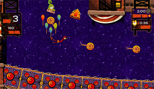
The Independent Games Festival recently announced the finalists for this year's Seamus McNally Grand Prize, and all of us here at GAMBIT were thrilled to find our game CarneyVale: Showtime included on the list. Showtime, which was developed by the GAMBIT Singapore Lab using XNA and is available for download now on Microsoft's Xbox LIVE community service, is the spiritual sequel to our summer 2007 prototype game Wiip. We sat down Desmond Wong, a recent graduate of Nanyang Polytechnic who was the lead artist for both Showtime and Wiip, to discuss how art was used to link the growing CarneyVale franchise together.
How was the art style chosen for Wiip?
During the concept stages of Wiip, the team was trying to settle on a suitable theme for a whipping game. We tried all sorts of ideas and eras ranging from cowboy western to jungle tribal. However, none of the themes had that special factor to them, they felt too overused and unoriginal. Eventually, the idea of being a ringmaster settled in. We knew it would be cool to be a raging ringmaster with a ferocious whip, and the idea of a mysterious circus quickly came into play.
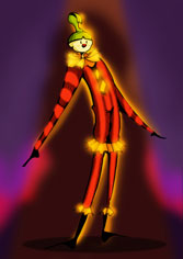
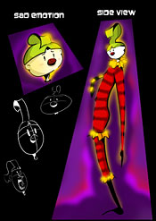
My initial concepts for Wiip were very dark and creepy, with outlandish animals and clowns. Although interesting, we knew that we needed something cuter and more approachable. Fortunately, the team had another artist who drew really cute and wonderful things. We had her take a stab at the early concepts, and she came up with her own cuter renditions. Eventually, the final product ended up as something both cute and creepy at the same time, a perfect balance between the two.
How did the art style change between Wiip and Showtime? If Wiip was the growing child, then Showtime is the maturing teenager. For Showtime, the art style took a more circus city feel to it. It was literally a city with circus performances on its streets. With that, we could have all assortments of neon signs, glowing lights and bustling color. The genral rendering of the characters also took a more mature turn. instead of kiddy characters, the characters in Showtime are more proportionate and grown. The style of shading also changed, employing more tones of shade and detail. Despite all the changes, the art style was generally kept to roughly the same feel. The bright and colorful characters and scenery were still present, and the quirky designs never disappeared. It was just an art style evolving as time went on. Who or what would you cite as the inspirations behind CarneyVale's art style? The biggest inspirations for the art style for Showtime were definitely Cirque du Soleil and Las Vegas. I remember the team watching video performances by the Cirque du Soleil troupe, and the costume designs just blew my mind away. Las Vegas was also a huge inspiration to the art style. Being a city circus, I looked to Las Vegas for its neon lights and signboards to give life to CarneyVale. I also used Las Vegas a lot when trying to merge a circus and city together. I would look at photos of that city, and imagine it with circus elements on it, and it would always work. Artists such as Yoji Shinkawa also give me tons of inspiration. Famous for his work in the Metal Gear series, what I really like about his works is his ability to generate such a distinct style of his own. The way he paints and conceptualises his ideas are what I respect most about this particular artist.
<a href="http://video.msn.com/video.aspx?vid=9c5941d9-8996-41e6-aaa1-e2c127bf19b2" target="_new" title="CarneyVale: Showtime trailer ">Video: CarneyVale: Showtime trailer </a>
The trailer for Showtime
How did you consciously use the art style to tie Wiip and Showtime together? The colors were the main things. When I was working on Showtime, I made sure that my color palette contained all the colors I used with Wiip. This was mainly the reds and yellows, however, I made sure to inject new tones and colors to keep things fresh. I also made sure to include the familiar red and white curtains from Wiip in Showtime as well. This served as a link between the two games, and added a distinct circus vibe to the game as well. The general details for the items in the world were also kept consistent to tie the two games together. For example, I employed a certain motif in Wiip that I reused on some of the props in Showtime to keep the world whole and seamless. Most importantly, the narrator for Showtime is the main character from Wiip. No better way to tie two games together than that.
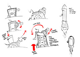
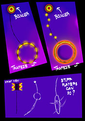
What's your usual workflow like? How do you go about creating a piece of art for the game? Usually I start with an idea. Ideas can come from anywhere. I got the idea for the Grabber prop by walking past those toy machines where you had to direct a hand to grab the toy you wanted. When I have a general idea down, I take it to the paper and pen. I sketch my ideas out and make sure to do as many variations of it as I can. I also find it very useful to get input from the people around me at this stage when the idea is still fresh and at its infant stage. Around this point, I start choosing the best few concepts and proceed to creating art for the game. I use Photoshop to draw out and color the art, and once that is done, I export it out and get it ready to be put into the game. From here on, it's mostly seeing what works and what does not. For example, the launcher for the missile looked good on paper, but when it was put into the game, it was a little too big and bright. The good thing is that once the art is there, it's mostly just tweaking to strike the perfect balance between making it look good and work well too. If you were to do a third game in the series, what new types of imagery would you like to explore? Wiip took place inside a busy circus tent, and Showtime took place in a bustling city at night. For the third installment, I would really like to see how the game would look like in outer space. We initially wanted to bring Showtime into space for the last few performances, but scrapped the idea in the end. What I really want to try is actually put Slinky in a world where gravity is at its weakest. The image of Slinky doing a double back flip in slow motion while floating upwards is too good to throw away. Being outer space, I could go crazy with the art style. There are just so many quirky things an artist can design when he isn't restricted. Imagine shooting through the stars on a flying comet as you are flung through rings of fire in front of a multi-colored nebula. It would be nothing short of legendary.
The winner of the Independent Games Festival's Seamus McNally Grand Prize will be announced at the Game Developers Conference in San Francisco this March. Keep an eye on this blog for more details! (Note: this post previously appeared over at GAMBIT co-PI Henry Jenkins' blog, "Confessions of an Aca-Fan", at www.henryjenkins.org. For a veritable cornucopia of media studies-related interviews, essays and insights, be sure to bookmark that site.)
Art trailer for Wiip
How did the art style change between Wiip and Showtime? If Wiip was the growing child, then Showtime is the maturing teenager. For Showtime, the art style took a more circus city feel to it. It was literally a city with circus performances on its streets. With that, we could have all assortments of neon signs, glowing lights and bustling color. The genral rendering of the characters also took a more mature turn. instead of kiddy characters, the characters in Showtime are more proportionate and grown. The style of shading also changed, employing more tones of shade and detail. Despite all the changes, the art style was generally kept to roughly the same feel. The bright and colorful characters and scenery were still present, and the quirky designs never disappeared. It was just an art style evolving as time went on. Who or what would you cite as the inspirations behind CarneyVale's art style? The biggest inspirations for the art style for Showtime were definitely Cirque du Soleil and Las Vegas. I remember the team watching video performances by the Cirque du Soleil troupe, and the costume designs just blew my mind away. Las Vegas was also a huge inspiration to the art style. Being a city circus, I looked to Las Vegas for its neon lights and signboards to give life to CarneyVale. I also used Las Vegas a lot when trying to merge a circus and city together. I would look at photos of that city, and imagine it with circus elements on it, and it would always work. Artists such as Yoji Shinkawa also give me tons of inspiration. Famous for his work in the Metal Gear series, what I really like about his works is his ability to generate such a distinct style of his own. The way he paints and conceptualises his ideas are what I respect most about this particular artist.
The trailer for Showtime
How did you consciously use the art style to tie Wiip and Showtime together? The colors were the main things. When I was working on Showtime, I made sure that my color palette contained all the colors I used with Wiip. This was mainly the reds and yellows, however, I made sure to inject new tones and colors to keep things fresh. I also made sure to include the familiar red and white curtains from Wiip in Showtime as well. This served as a link between the two games, and added a distinct circus vibe to the game as well. The general details for the items in the world were also kept consistent to tie the two games together. For example, I employed a certain motif in Wiip that I reused on some of the props in Showtime to keep the world whole and seamless. Most importantly, the narrator for Showtime is the main character from Wiip. No better way to tie two games together than that.
What's your usual workflow like? How do you go about creating a piece of art for the game? Usually I start with an idea. Ideas can come from anywhere. I got the idea for the Grabber prop by walking past those toy machines where you had to direct a hand to grab the toy you wanted. When I have a general idea down, I take it to the paper and pen. I sketch my ideas out and make sure to do as many variations of it as I can. I also find it very useful to get input from the people around me at this stage when the idea is still fresh and at its infant stage. Around this point, I start choosing the best few concepts and proceed to creating art for the game. I use Photoshop to draw out and color the art, and once that is done, I export it out and get it ready to be put into the game. From here on, it's mostly seeing what works and what does not. For example, the launcher for the missile looked good on paper, but when it was put into the game, it was a little too big and bright. The good thing is that once the art is there, it's mostly just tweaking to strike the perfect balance between making it look good and work well too. If you were to do a third game in the series, what new types of imagery would you like to explore? Wiip took place inside a busy circus tent, and Showtime took place in a bustling city at night. For the third installment, I would really like to see how the game would look like in outer space. We initially wanted to bring Showtime into space for the last few performances, but scrapped the idea in the end. What I really want to try is actually put Slinky in a world where gravity is at its weakest. The image of Slinky doing a double back flip in slow motion while floating upwards is too good to throw away. Being outer space, I could go crazy with the art style. There are just so many quirky things an artist can design when he isn't restricted. Imagine shooting through the stars on a flying comet as you are flung through rings of fire in front of a multi-colored nebula. It would be nothing short of legendary.
The winner of the Independent Games Festival's Seamus McNally Grand Prize will be announced at the Game Developers Conference in San Francisco this March. Keep an eye on this blog for more details! (Note: this post previously appeared over at GAMBIT co-PI Henry Jenkins' blog, "Confessions of an Aca-Fan", at www.henryjenkins.org. For a veritable cornucopia of media studies-related interviews, essays and insights, be sure to bookmark that site.)

