 |


 |
||||||
A House Out of Time (2015) |
||||||
|
The challenge
As part of my doctoral work in the Media Arts and Practices program at USC's School of Cinematic Arts, I was invited to participate in my first gallery show. I was thrilled at the opportunity, but also sort of stumped. What could I make that would hold its own beside more professional fine artists' works? What aspect of my work in transmedia storytelling would best lend itself to such an environment? The solution
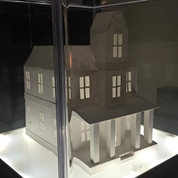
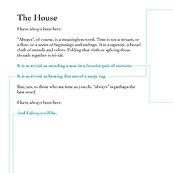
After going through multiple concepts, I finally settled on a fairly simple idea. In my work I talk at length about leveraging the affordances of multiple media – so why not think of a gallery space as its own kind of medium? Actually, A House Out of Time is the third part of a trilogy of explorations into spatial storytelling, preceded by The Lighthouse in the Woods, which explored how to tell stories in a 360-degree environment surrounding the audience, and On Wings of Flame, which explored how to tell stories as players move from location to location in a real-world city. A House Out of Time is a different kind of ghost story, an experiment in location-specific storytelling, tangible (artifact-centric) storytelling, and the intertextuality that drives the best transmedia storyworlds. At its center is a paper model of a haunted house, set atop a large plinth. On each side of the plinth is one of four interconnected stories set in different eras (1939, 1989, 2039, and an unnamed period). Audiences are invited to experience each story independently, reading each side's story from top to bottom, or to walk around the plinth and follow the connections between the stories to find the secret behind the house itself. Each story stands on its own, but is improved if the audience experiences it in the context of the others – the same kind of intertextal additive comprehension behind such successful transmedia storyworlds as Assassin's Creed or Halo. There's also a subtle interactive feature in A House Out of Time: every so often, if a new tweet has been posted with #HouseOutOfTime, the lights of the house will flicker green for a few seconds. It's designed to surprise and delight viewers who don't know it's there (suggesting the paper house is itself haunted) and extends the "collapsing time" theme of the story but not having it respond immediately to those triggers. A House Out of Time had its first public showing at the USC School of Cinematic Arts' Media Arts and Practices division's "Against Practice" gallery show in early December of 2015. The team
The tools
For A House Out of Time, I conceived of the project, wrote the original short story, and created the paper model. The physical installation of A House Out of Time was created using Adobe Illustrator, wood, melamine boards, a whole lot of posterboard, and a collection of LittleBits paired with IFTTT.
|


