 |

|
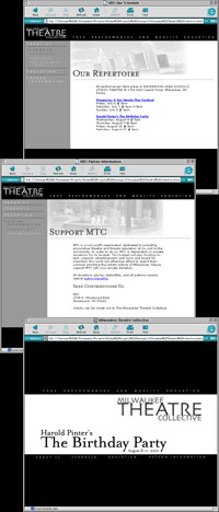
Milwaukee Theatre CollectiveThe challenge When my longtime friend and fellow Inkblots alum Jessica Avellone announced she was going to be a founding member of a small theater troupe, several things became apparent. One, the Milwaukee Theatre Collective was going to need a "look". Two, said look was going to have to be affordable, as all the members were drama students from Boston University on their summer vacation. And three, this needed to be done quickly. The answer The resulting site was a case study in creativity amplified by restricted resources. The group needed to simultaneously convey artistry, imagination and elegance, so we decided to use a black and white palette. This was driven primarily by the print costs needing to be kept to an absolute minimum, but the resulting web site was stunning. Simple, straightforward and understated, the site presented information on the troupe members, their upcoming performances and programs, and different ways that the public could help support the group, all while maintaining a very classy, modern look and feel. The logo was designed to convey that same feeling - classic, smart and modern. The finished site went live in the early summer of 2001 and was maintained through the end of the inaugural season. The tools The Milwaukee Theatre Collective site was built using Photoshop, ImageReady, Illustrator, Dreamweaver UltraDev, HTML, and JavaScript.
|
|


