 |

|
NerdUp, LLCThe challenge
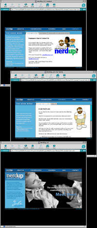
As the Internet boom waned, Nerd Up, LLC found itself in a bit of a predicament. One of the basic fundamentals of the site was its fun-loving, enthusiastic attitude - something that was decidedly at odds with the zeitgeist of mid-2001. The first version of the site that I designed was brightly-colored and illustrated with grinning cartoon nerds, but now it needed to attract older, more executive candidates in addition to the more playful code jockeys that were the first version's primary audience. In short, it needed to grow up. The answer
The biggest challenge in the creation of nerdup.com 2.0 was maintaining consistency across versions. The answer was to keep the cartoon nerds, but set them in a more grown-up environment. We pared back the color palette from its previous bright crayon hues to a more refined blue, white and black, then compressed the entire site down into a much smaller screen footprint. This made the site feel "older," but we also needed to pump up the personal aspect of Nerd Up. This led to the biggest new design element: the inclusion of "sound bite" testimonials to each and every page in the new site. Since the smaller layout led to more bite-sized sections, we were able to fit in at least a dozen different recommendations of the company's services, all while keeping the site both attractive and quick-loading. In the end, we accomplished exactly what we had been brought on to do: update a site's primary look and feel from youthful exuberance into a more mature yet still upbeat sense of responsibility. Nerdup.com 2.0 was launched on Labor Day weekend, 2001. The tools
Nerdup.com 2.0 was built using the basics: Photoshop, ImageReady, Dreamweaver, HTML and Javascript.
|
|


